ChartGPT AI
ChartGPT turns a pasted table or a plain sentence into a presentation-ready chart in seconds, with PNG, SVG and PDF export on a free plan. Fast and opinionated, with a few rough edges.

Reads messy pasted data brilliantly and exports clean files with no sign-in, let down by a reproducible axis bug and zero saved chart history.
Should you use ChartGPT?
Consultants, founders and marketers who build slide decks under deadline and need clean charts fast from messy spreadsheet data.
You need saved chart history , control over colour and axes, or a tool that catches its own labeling bugs. Nothing you make is stored.
Free genuinely covers 15 charts a month with every type and full export. Weekly deck work needs Pro at $14.99/mo .
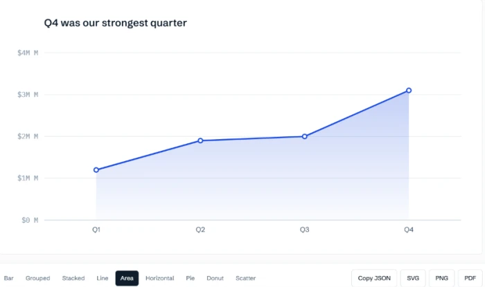
The millions unit doubles on the y-axis ("$4M M"), and finding-style titles freeze when you switch chart type without regenerating.
What is ChartGPT?
ChartGPT does one thing. You paste a table or type a sentence, and it reads the numbers, picks a chart and draws it with the conventions a careful analyst would use anyway: a zero baseline on bars, sorted rankings, labeled axes. Then you export a PNG, SVG or PDF and drop it into a deck. There is no dashboard, no project list, no saved history. The chart lives in the browser tab until you download it, and closing the tab loses it.
That narrow scope is the point. It is built for people making charts against a clock: consultants with eleven charts due tomorrow, founders assembling a board pack, marketers turning survey results into something postable. It runs in the browser on any device, needs no account to try, and uses an OpenAI model only for the language step of reading your prompt, with its own code doing the drawing so charts come out looking consistent. If you want a tool that stores your work or lets you hand-tune every colour, this is not it.
Key features & how they perform
Each feature rated from hands-on testing of the free tier and the tool's documented behavior.
Messy-paste parsing
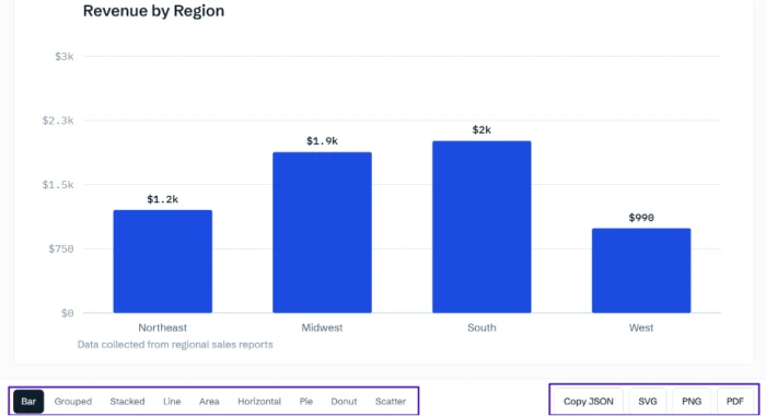
Dollar signs, quoted comma-numbers, stray totals rows and mixed date formats get read correctly. In testing it dropped a TOTAL row instead of drawing it as an extra bar.
PNG, SVG and PDF export
All three download with no sign-in, on every plan. The SVG stayed sharp when zoomed hard and the exported PDF matched the on-screen chart exactly.
Nine chart types, instant switching
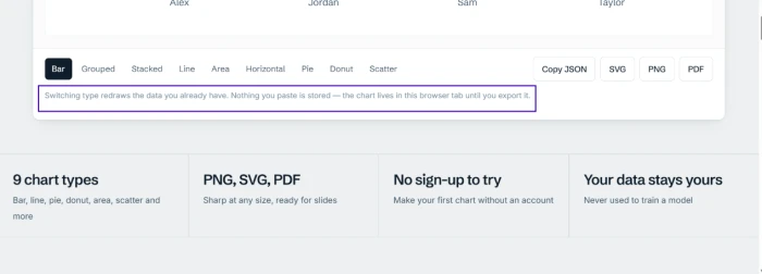
Bar, line, pie, donut, area, scatter, stacked, grouped and horizontal bar. Switching type redraws your data on the spot with no second trip to the model.
Finding-style titles
Tell it the point and the heading argues it: "Q4 was our strongest quarter" instead of "Revenue by quarter". The title does not update if you later switch chart type.
Opinionated chart defaults
Zero baselines, sorted rankings and one colour per series are built in. The promised grey-out of non-highlighted bars did not fire in testing, and colour and axis range cannot be overridden.
No-storage privacy model
Nothing you paste is saved or used to train a model, on any plan. The flip side is zero chart history, so an unexported chart is gone when the tab closes.
Feature ratings from hands-on testing plus the tool's documented behavior. ChartGPT is new and has minimal dedicated third-party review coverage, so these lean on direct testing.
Trying to break ChartGPT with messy data and edge cases
A deliberately ugly paste, an argument-style title, nine chart types and the exports that come out.
Reading a deliberately messy paste
ChartGPT's headline promise is that it reads what you actually have, not what a clean spreadsheet would look like. My first test aimed straight at that.
I pasted a small table built to cause trouble. One value carried a dollar sign, another was a comma-number wrapped in quotes, and a stray TOTAL row sat at the bottom that should never become its own bar.
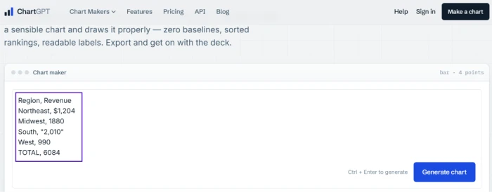
The generated chart is where you find out whether it untangled any of that.
Titles that state a finding
The site makes a specific claim about titles: tell it what the chart is for and the heading will argue the point instead of naming a variable.
I gave it four quarters of revenue and told it, in plain words, that I wanted to show Q4 was the strongest quarter.
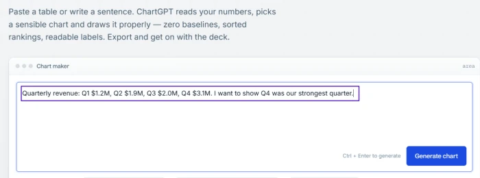
The result carried both the promised behavior and a defect I could reproduce.
Switching chart types and the grey-out that never came
A switcher along the bottom flips the same data into any of nine formats without a fresh generation. I leaned on it throughout so my screenshots would not all be identical blue bars.
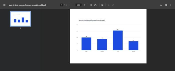
For this test I gave it units sold by four sales reps and asked it to point out that Sam led the group.
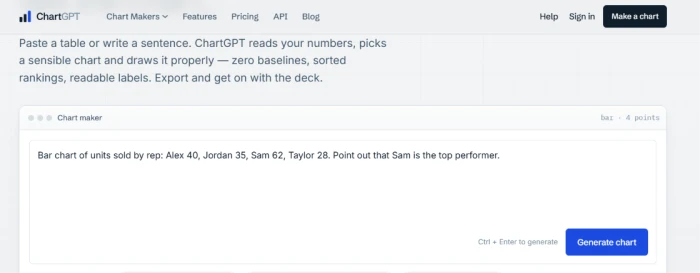
The homepage makes a specific promise here: single out one value and the other bars fade to grey so the winner stands out.
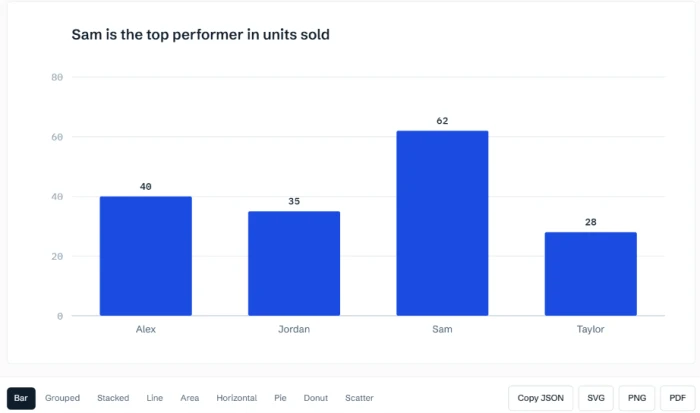
The switching itself was the fast part, and a line under the controls spells out the trade-off.
Exporting to PDF and SVG
Export is usually where free tiers get stingy. ChartGPT does not: PNG, SVG and PDF all download straight to disk with no sign-in, on every plan.
I checked the two that matter for a deck, starting with the PDF of the rep chart.
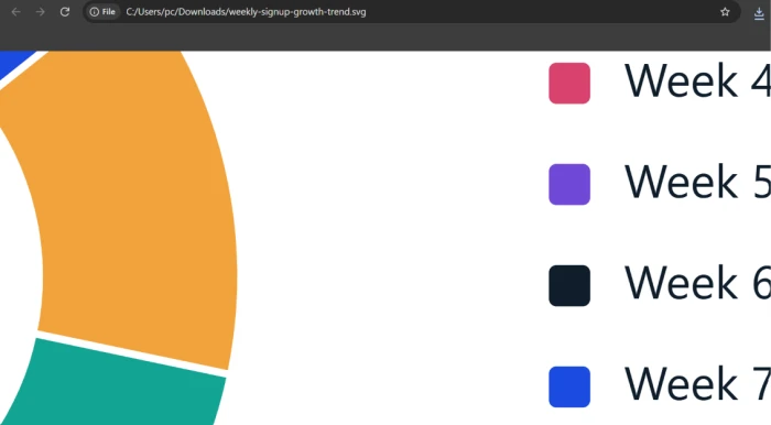
SVG is the one to use for anything projected, so I pushed it harder and zoomed in.
The title that froze on a chart-type switch
One quirk surfaced while I cycled through formats. I had a run of weekly signups loaded and picked the donut view to add variety.
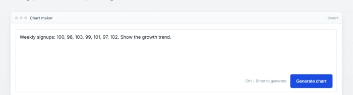
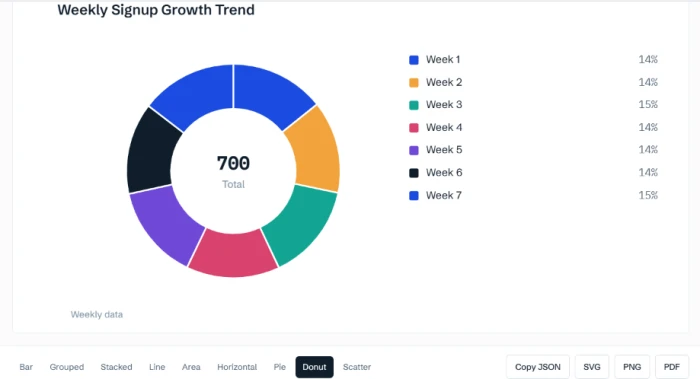
The chart changed shape. The heading above it did not.
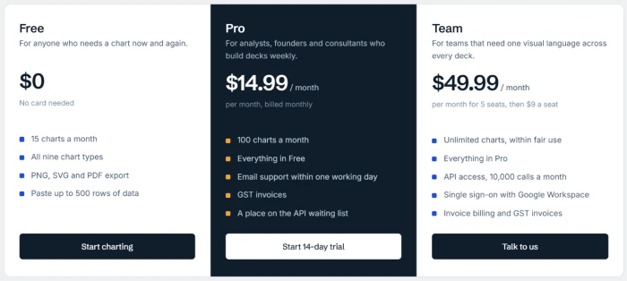
ChartGPT pricing
Figures taken from the official ChartGPT pricing page, in US dollars.
| Plan | Price | What's included |
|---|---|---|
| Free | $0 | 15 charts/month · all nine chart types · PNG, SVG, PDF export · paste up to 500 rows · no card |
| Pro Popular | $14.99 /mo | 100 charts/month · everything in Free · email support within one working day · GST invoices · API waiting list |
| Team | $49.99 /mo | 5 seats, then $9 a seat · unlimited charts (fair use) · API access, 10,000 calls/mo · Google Workspace SSO · invoice billing |
Pros & cons
Specific conclusions from hands-on testing and the tool's own documentation, not generic filler.
✅ Pros
- Parses messy paste: dollar signs, quoted comma-numbers and stray totals rows
- Dropped a TOTAL row instead of drawing it as a false fifth bar
- PNG, SVG and PDF export on every plan, no sign-in required
- Exported SVG stayed sharp when zoomed hard, clean for projection
- Nine chart types switch instantly with no second model call
- Finding-style titles argue the point: "Q4 was our strongest quarter"
- Free plan gives 15 charts a month with all nine types
- Nothing pasted is stored or used to train a model
⛔ Cons
- Millions unit doubles on the y-axis: "$4M M" on every millions chart
- Promised grey-out of non-highlighted bars never fired in testing
- Titles freeze on a chart-type switch: donut kept a "trend" heading
- Zero chart history on any plan, unexported charts vanish with the tab
- Colour and axis range are automatic and cannot be overridden
- No self-service upgrade; Pro requires emailing support to start
Synthesized from hands-on testing plus the official site and help centre · ChartGPT has little third-party review coverage yet · paraphrased, not quoted
ChartGPT scorecard
Rated against what a text-to-chart tool is actually built to do.
| Dimension | Verdict | Score |
|---|---|---|
| Data parsing & cleanup Messy paste, mixed formats, stray rows | Excellent |
9.0
|
| Export quality & formats PNG, SVG, PDF fidelity and sharpness | Excellent |
9.0
|
| Speed & responsiveness Generation and instant type switching | Excellent |
9.0
|
| Ease of use One box, one canvas, no account | Excellent |
8.5
|
| Chart type variety & switching Nine formats, no re-generation | Good |
8.0
|
| Value for money Free allowance and plan pricing | Good |
8.0
|
| Insight-style titles Findings stated instead of variables | Good |
8.0
|
| Chart accuracy & labeling Axes, units and baselines drawn correctly | Good |
7.0
|
| Feature reliability Promised behavior vs what actually fires | Average |
6.5
|
| Data persistence & history Saved charts and recall across sessions | Average |
6.0
|
| Scrutool Score Equal-weight average of all 10 dimensions |
7.9
|
What users say about ChartGPT
Themes that surface most in testing and early feedback, by rough share of mentions.
Themes drawn from hands-on testing, the product's own documentation, and general text-to-chart category sentiment. ChartGPT is new with minimal dedicated review volume, so percentages are honest estimates rather than aggregated review counts.
Brilliant at reading your data, careless with the labels it prints on top
ChartGPT is built around one loop, and most of that loop is excellent. It reads messy pasted data that would trip up a spreadsheet, drops totals rows that should not become bars, writes titles that argue a point, and exports PNG, SVG and PDF that hold up under zoom, all without an account. Where it stumbles is on the details it draws attention to itself. The millions unit doubles on the y-axis on every chart, a defect obvious enough to embarrass a client deck. The grey-out highlight the homepage promises did not fire in testing, and finding-style titles freeze the moment you switch chart type. There is also no saved history on any plan, so an unexported chart is gone when the tab closes. Consultants, founders and marketers who make charts in short bursts and export as they go will find it faster than anything with a full editor. Anyone who needs saved projects, fine control over colour and axes, or a tool that catches its own mistakes should wait for the fixes or look elsewhere.
Discussion
Join the discussion and share your perspective.