
Datawrapper AI
Datawrapper is a no-code web app for building responsive charts, maps and tables that publish straight to the web. Newsroom-grade defaults, but it cleans no data and styling stays deliberately narrow.

Publication-ready charts, maps and tables in minutes, if you arrive with clean data and can live with a deliberately narrow set of styling controls.
Should you use Datawrapper?
Journalists, analysts and comms teams who need clean, responsive charts and maps fast, and who already work from tidy spreadsheets.
You need deep custom styling , linked dashboards, or a tool that will clean messy data for you rather than reject it.
Free covers web embeds fully (with a credit line). Removing it and unlocking PDF/SVG starts at $21 per user/mo .
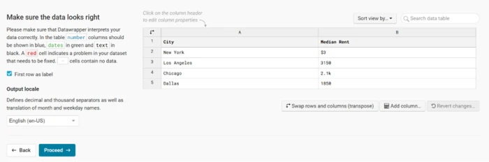
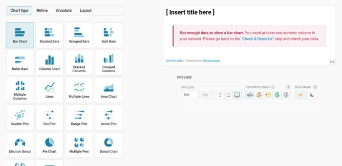
It does zero data cleaning . Currency symbols and shorthand like 2.1k break number parsing before a chart will even draw.
What is Datawrapper?
Most charting tools hand you a blank canvas and a hundred settings. Datawrapper hands you a finished chart. Paste a table, pick a type, and the sorting, number formatting, spacing and typography are already publication-ready before you touch a single control. That opinionated, defaults-first approach is why newsrooms like Reuters, the New York Times and the Washington Post build live news graphics with it, and why it suits journalists, analysts and communications people more than data scientists.
It runs entirely in the browser, with no install and no account needed to try, and covers over 20 chart types, three kinds of map, and flexible tables. The output is responsive by default: one embed redraws itself for every screen width. The trade-off is control. Datawrapper cleans no data and its styling is deliberately narrow, so you either bring tidy, correctly-keyed data and accept the house look, or you reach for a heavier tool.
Key features & how they perform
Each feature rated from hands-on testing and aggregated review sentiment.
20+ chart and 3 map types
Bar, line, scatter, range and election charts, plus choropleth, symbol and locator maps and sortable tables, all in one editor.
Publication-ready defaults
Sorting, comma separators, spacing and typography are set for you, so the first draft already looks ready to ship.
Responsive embeds
Charts redraw for narrow screens automatically, so one embed serves phone and desktop with nothing to maintain twice.
Live data links
Link a Google Sheet or URL and the published chart refreshes on its own, with no re-upload needed.
Maps that match your data
Choropleth and locator maps look sharp, provided every region label lines up with the basemap exactly.
Team publishing & collaboration
Real-time editing, in-editor comments, shared folders and one-click republish keep a whole team on the same charts.
Feature ratings blended from G2, Capterra & Reddit review patterns + hands-on testing.
How Datawrapper Performed in Practice
A default bar chart, a responsive line chart, a US state map, free-tier export, and one deliberately dirty dataset.
Getting data in and the first bar chart
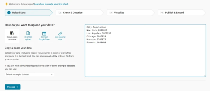
Datawrapper opens straight into a four-step editor, and the first step is getting data in. It accepts a pasted table, a CSV or Excel upload, a linked Google Sheet, or an external URL. That is the whole list.
There is no database connector and no prompt box that turns a sentence into a chart. You bring the numbers yourself, in a shape it can read.
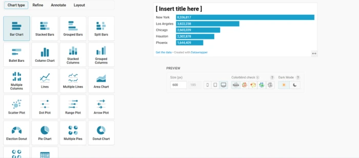
To start simple, I pasted the five biggest US cities and their populations, then let the tool pick the default chart.
One click later, before I touched any settings, it drew this.
Time series and mobile rendering
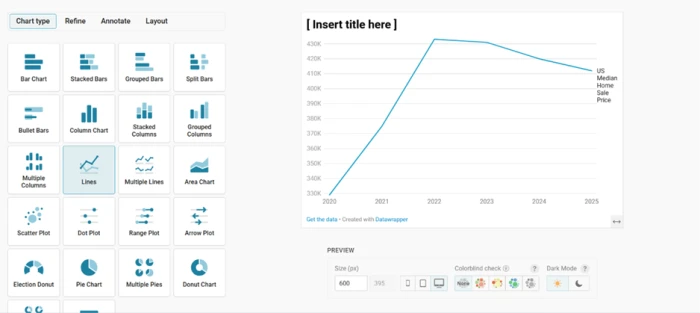
The same paste-and-pick flow covers time series. I loaded US median home sale prices from 2020 through 2025 and switched the chart type to a line with one click.
The reason newsrooms lean on Datawrapper is the next part. Responsiveness is automatic, and every published chart carries the logic to redraw itself for the screen it lands on.
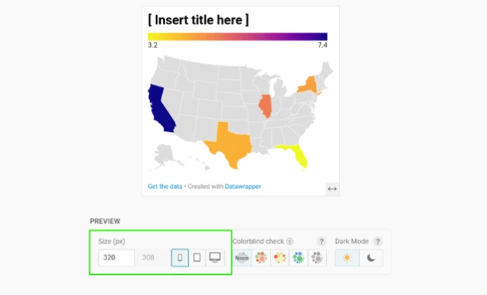
To check that claim, I dragged the live preview down to 320 pixels, roughly the width of a small phone.
Then I pulled the preview width down to phone size.
Mapping US state data
Maps sit alongside charts in the same editor. Datawrapper offers choropleth, symbol and locator maps, and for a US state choropleth it prefills the table with all fifty states plus DC.
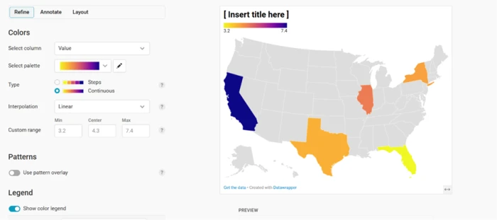
You fill in values for the regions you care about and leave the rest blank. The tool shades what you gave it and greys out what you did not.
I entered figures for California, Texas, Florida, New York and Illinois to see how little data it needed.
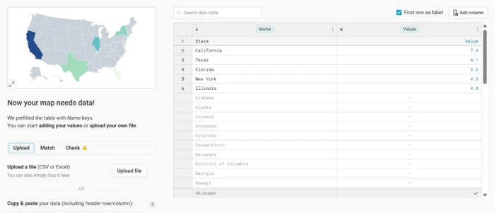
With five values typed in, the map rendered like this.
Publishing and export on the free plan
Publishing is where the free plan draws its lines, and to its credit it draws them in plain sight rather than hiding them.
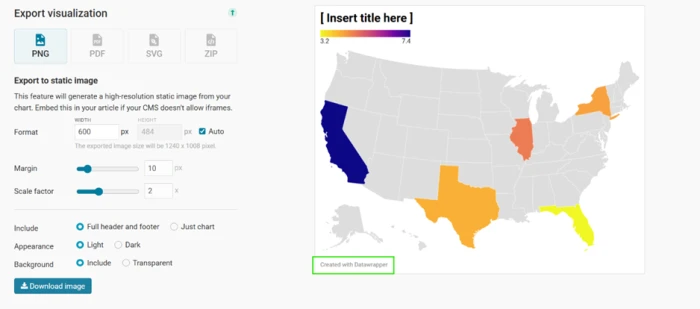
You can publish and embed on the web for free, with no limit on how many people view the chart. The export menu is another matter, and it marks the paid formats openly.
I published a finished chart and opened the export panel to see what a free account actually gets.
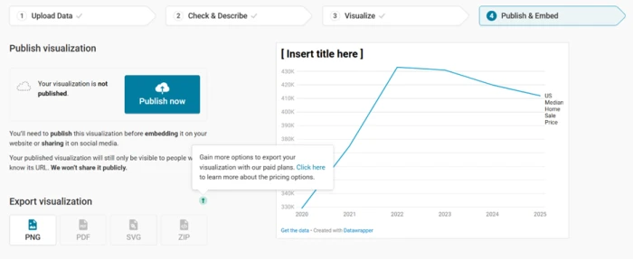
The exported file told the rest of the story.
Where it struggles: messy data
Everything above used clean, correctly-keyed data. The last test handed Datawrapper the kind of messy copy-paste real work produces, to see how it coped.
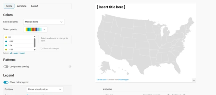
It does not cope, and it does not pretend to. Datawrapper runs no data cleaning of its own. Labels have to match its basemaps character for character, and numbers have to read as numbers.
I fed it real US metro names against a state map, then a rent column mixing dollar signs and shorthand, and watched both fail.
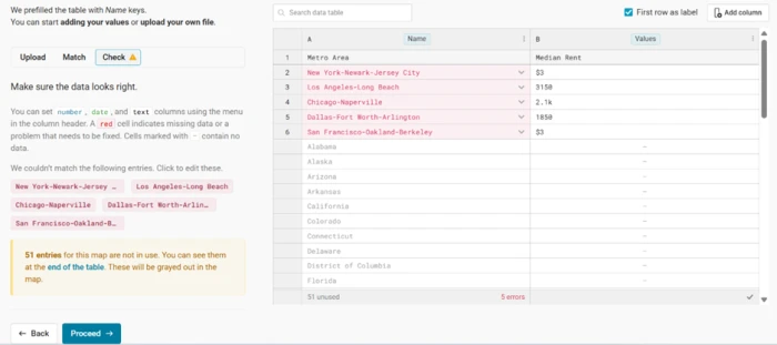
The rejected labels left the map empty.
To isolate the number problem from the mapping problem, I dropped a rent column into a plain bar chart.
With the column read as text, the chart would not render at all.
Datawrapper pricing
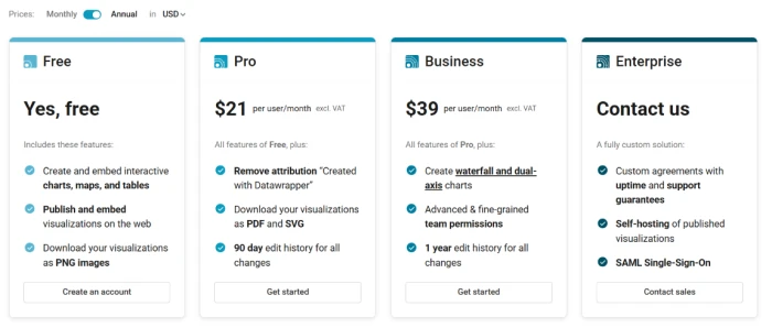
Figures taken directly from the official Datawrapper pricing page. Prices are per user, per month, and exclude VAT.
| Plan | Price | What's included |
|---|---|---|
| Free | $0 | Create, publish & embed charts, maps and tables · PNG export · 30-day edit history · "Created with Datawrapper" credit |
| Pro Popular | $21 /user/mo | Everything in Free · removes attribution · PDF and SVG export · 90-day edit history · image publishing |
| Business | $39 /user/mo | Everything in Pro · waterfall and dual-axis charts · fine-grained team permissions · 1-year edit history · priority support |
| Enterprise | Contact us | Everything in Business · SAML/OIDC SSO · self-hosting of embeds · unlimited edit history · uptime SLA · account manager |
Pros & cons
Specific conclusions from testing and real user reviews, not generic filler.
✅ Pros
- Publication-ready defaults: charts look finished before you change a setting
- Responsive embeds redraw for every screen width from one maintained chart
- Imports from paste, CSV, Excel, Google Sheets or a live URL
- Linked Sheets and URLs keep published charts updating without re-uploading
- No reader tracking and no cookies; embeds are Do Not Track by default
- Published charts stay online permanently, even after you cancel
⛔ Cons
- Runs no data cleaning, so messy columns must be fixed before upload
- Font and color controls are shallower than Flourish or Tableau
- New chart types arrive slowly, by the team's own admission
- No prompt-to-chart or AI assist; every visualization is built by hand
- The editor can slow down on very large datasets
- Not a dashboard tool; it builds single charts, not linked exploratory views
Synthesized from real reviews on G2, Capterra, Reddit & hands-on testing · paraphrased, not quoted
Datawrapper scorecard
Rated against what a no-code chart and map tool is actually built to do.
| Dimension | Verdict | Score |
|---|---|---|
| Chart & map variety Breadth of chart, map and table types | Good |
8.0
|
| Default design quality How good output looks unedited | Excellent |
9.0
|
| Responsive embeds Redraw across screen widths | Excellent |
9.0
|
| Ease of use Signup, editor, four-step flow | Excellent |
8.5
|
| Data import & handling Cleaning, parsing, large datasets | Average |
5.5
|
| Maps & geographic viz Choropleth and locator quality | Good |
7.5
|
| Customization & branding Fonts, colors, custom themes | Good |
7.0
|
| Export & publishing Formats and free-tier limits | Average |
6.5
|
| Team & collaboration Real-time editing, comments, SSO | Good |
7.5
|
| Value for money Free tier depth and paid pricing | Good |
7.5
|
| Scrutool Score Equal-weight average of all 10 dimensions |
7.6
|
What users say about Datawrapper
The themes reviewers raise most often, by share of analysed reviews.
% = share of analysed reviews mentioning each theme (G2, Capterra, Reddit)
The fastest route from a clean spreadsheet to a chart you can publish
Datawrapper earns its place in newsrooms by making the boring parts automatic. Paste tidy data, pick a type, and the sorting, number formatting, spacing and responsive behaviour are handled before you touch a control, which is why Reuters, the New York Times and the Washington Post ship live graphics with it. The limits are just as clear. It cleans no data, so a stray dollar sign or a metro label that does not match the basemap stops a chart cold. Styling is deliberately narrow, deeper branding sits behind a costly theme add-on, and the free plan exports PNG only with a Datawrapper credit. Journalists, analysts and communications teams who work from clean data and want charts that look right by default will get real value here. Anyone who needs pixel-level custom styling, linked dashboards, or a tool that fixes messy data for them should look at Flourish, Tableau or a full BI platform instead.
Discussion
Join the discussion and share your perspective.